
Choosing the Right Chart: A Practical Guide for UX Designers
(Nowhere near) Everything You Need to Know About Data Visualization

Before we start, let's make sure we're on the same page about what data visualization is.
Data visualization is the process of representing quantitative information graphically by transforming data values into visual elements such as position, shape, size, and color. This approach enables the human brain to more easily interpret patterns, relationships, and differences within the data, supporting clearer communication, deeper exploration, and more compelling storytelling, all while balancing accuracy with effective design.
In essence, it reduces our cognitive effort to understand complex quantitative data using aesthetics.
Creating data visualizations isn’t always easy, especially with so many chart types to choose from for the same data set. It’s not just about making things look visual, you need to make sure you’re using the right chart for the right situation.
However, the right question isn’t “Which chart should I use?” but rather: “What do I want to communicate with this chart?” or “What story am I trying to tell?”
What to consider before choosing a chart
Context
Find the answer for this two questions.
What is the story your data is trying to deliver?
Understanding the source of the data and what it's trying to communicate will make choosing a chart type much easier. Is the data meant to show trends, comparisons, distributions, or relationships?
Who will you present your results to?
Knowing your audience is crucial for choosing the best chart type for efficient data communication. You need to understand their level of familiarity with the data and the topic.
Less is more
Keep things simple and clear. Avoid unnecessary styling like 3D effects, shading, shadows, gradients, distorted colors, excessive gridlines, or overly decorative fonts. These elements can distract from the actual data and make the visualization harder to read. Be confident in removing anything that doesn't directly support the message you want to communicate. In many cases, using multiple clean charts is far more effective than trying to cram everything into one overly complex, crowded graphic. The goal is clarity, not decoration.
Focus on the main message
Use preattentive attributes like color, size, and position to guide your audience’s focus, highlight only the most important part of the visual, include clear labels and descriptive text to help with interpretation, and ensure the headline communicates the core message you want to convey.
Tell a story whenever possible
Start by identifying the big idea you want to communicate, then think about the order and flow of your story so the data supports your narrative, and even if you're using automatically generated charts, make sure each one is clearly explained and leaves your audience with a clear takeaway.
OK, with that in mind and all questions answered, we can move on to the next phase.
Which type of chart should I use?
I’ve divided it into six use cases and suggested chart options for each one. See if any of them fit your needs.
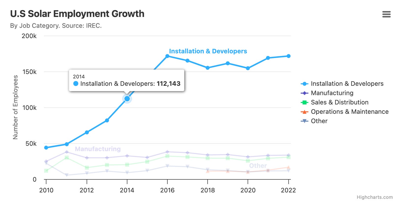
1. Data that changes over time
Bar chart: Bar charts can show change over time, especially for discrete time intervals. Vertical bar charts (column charts) and stacked bar charts can be used to show changes over time. However, for continuous time series, line charts are often preferred.
Line chart: Line charts are specifically designed to represent trends in data over intervals of time (time series) and illustrate how values change over time.
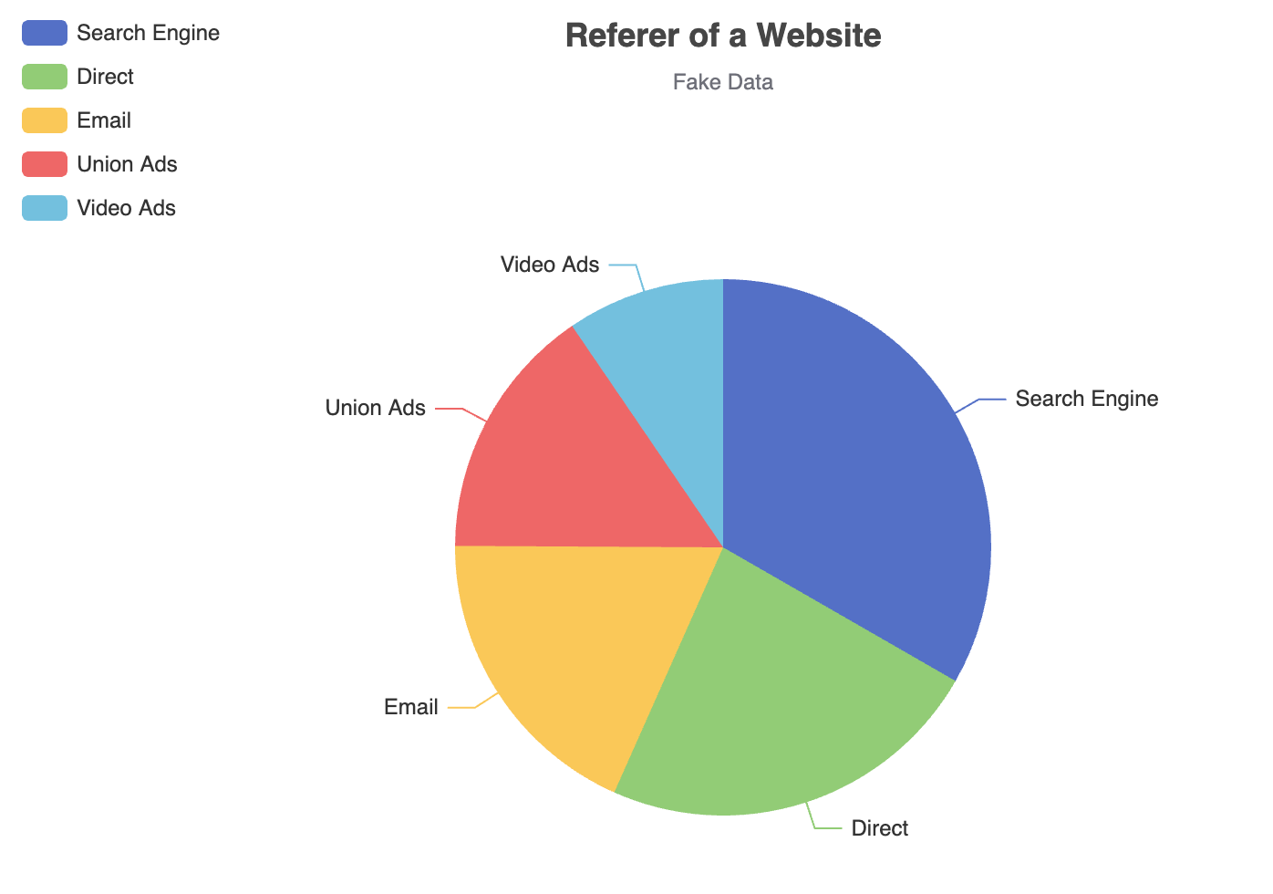
2. Showing parts of a whole
Pie chart (or donut chart): Pie charts clearly visualize data as proportions of a whole. However, sources note limitations, especially with more than a few categories. Donut charts have similar limitations.
Stacked area chart: Stacked area charts can show trends over time that add up to 100% or represent the volume of data as parts of a whole over time.
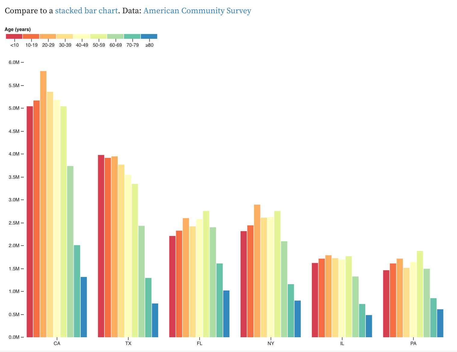
Stacked bar chart: Stacked bar charts show proportions and quantities within a whole category and can be used to show parts of a whole. 100% stacked bar charts specifically emphasize the relative proportions.
Treemap: To visualize hierarchical proportions, especially with many categories.
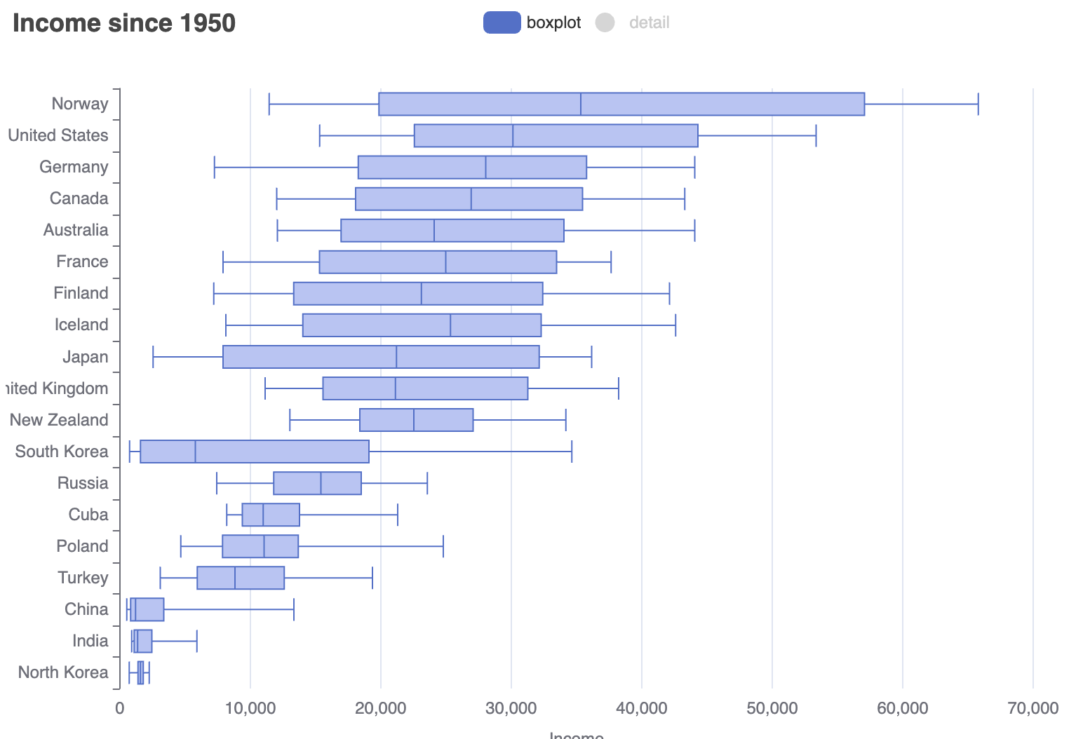
3. Data distribution
Histogram: Histograms are specifically used to show the frequencies of a single variable grouped into bins or frequency ranges, illustrating the shape of the data's distribution.
Violin plot: Violin plots are mentioned as useful for visualizing many distributions at once and showing overall shifts among them.
Box plot: Box plots display the distribution of values of a single variable, showing the range, quartiles, and potential outliers.
4. Comparing groups
Bar chart: Bar charts are excellent for simple comparisons between categories and for precise comparisons of values across different groups. Grouped bar charts (side-by-side or clustered) are specifically designed for comparing two or more groups within each category.
Line chart: Line charts can be used to compare trends of multiple series over the same timeline.
Grouped bar chart: As mentioned above, grouped bar charts are a primary way to compare different groups within categories.
5. Relationship between variables
Scatter plot: Scatter plots are the archetypical visualization for showing the relationship between two quantitative variables, revealing correlations and clustering.
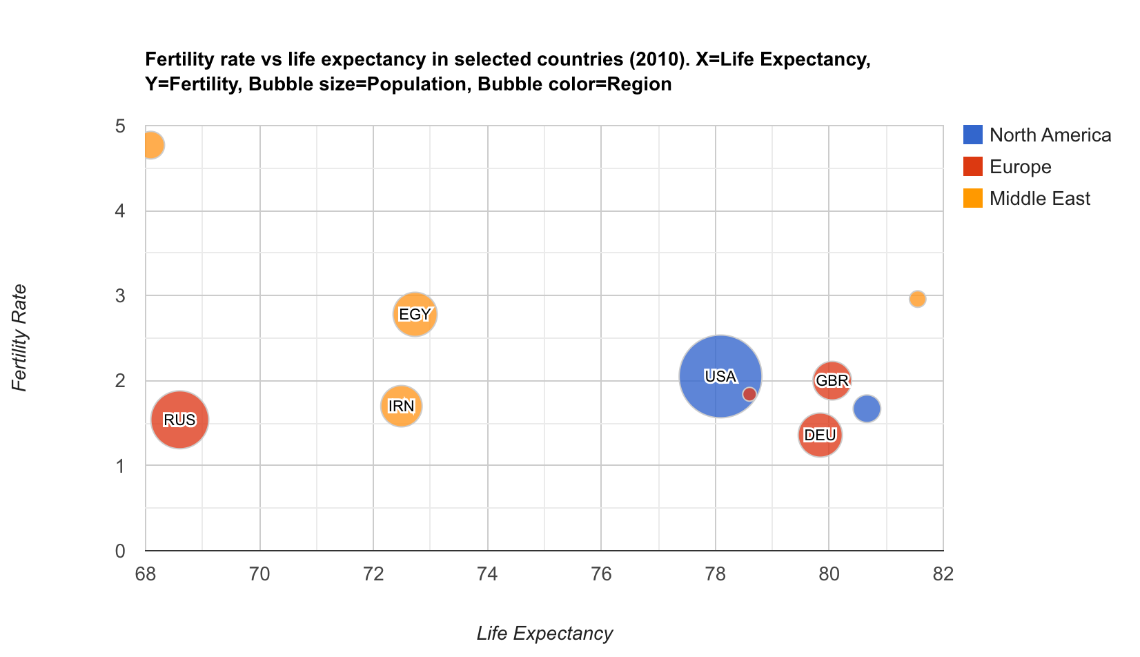
Bubble chart: Bubble charts are a variant for three or four variables. Connected scatterplots can show temporal sequences of two response variables.
Heatmap: Heatmaps represent data in a table or matrix using color to visualize the magnitude of values, which can reveal relationships or correlations between variables.
6. Geographic distribution
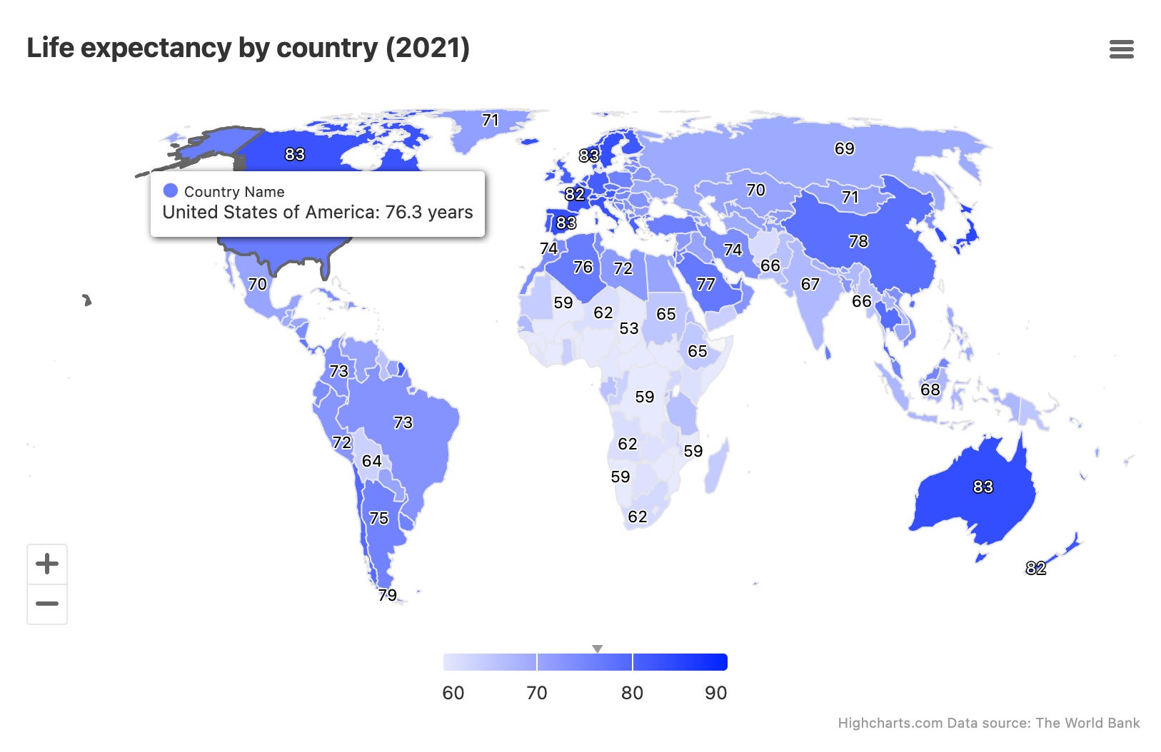
Choropleth (map-based heatmap): Choropleth maps use color gradients to compare different geographic regions based on a specific variable.
As you can see, there are many ways to display data visually. Beyond that, you can mix and combine chart types for specific cases, leaving plenty of room for experimentation.
Best Practices
Here are some straightforward guidelines to avoid common pitfalls.
Line and bar charts should always have a baseline starting at zero.
Avoid too many slices in pie charts. If there are too many, consider using a different type of visualization. Consider grouping the smallest pie chart segments into an “Other” slice.
Do not overlap labels on pie chart slices.
Organize bars hierarchically, either in ascending or descending order.
Use descriptive text and labels in your visualizations.
Chart Frameworks
Before you running wild with your creativity, designing overly complex or crazy charts and making front-end developers’ lives a nightmare, keep in mind that there are several well-established charting frameworks in the market. Your product will likely use one of them (if it doesn’t already). Make sure your designs are adaptable to these libraries. It will make implementation much easier. Talk to your developer, it won’t hurt (I guess).
Here are some of the most popular libraries:
If you’ve made it this far, I believe you’ve already gained a solid foundation to start making informed decisions about choosing the right chart for each use case.
Now, let’s get to work!
If you’re wondering where to start with AI interactions, I recommend the AI-Powered UX: Next-Gen Product Design course on Udemy. In this course, I teach how to use AI for research, data analysis, ideation, and prototyping, transforming the way you design digital products. The course is in English but includes Portuguese subtitles.